

About the project
As part of this project, I redesigned two key pages of the official website of the Canadian Cancer Society (https://cancer.ca/en/). The main goal was to enhance the user experience, improve visual appeal, and align the content with modern web design standards. The entire project was completed within one day, demonstrating strong time management skills and the ability to deliver high-quality work under tight deadlines.


Before Redesign
The page relied heavily on a bold yellow background and large text, with the photo playing a secondary role. The layout felt busy and overly promotional, with decorative fonts that distracted from the main message.

After Redesign
The redesign shifts focus to the photo, creating a more emotional and human connection. The layout is cleaner, the call-to-action is clearer, and the overall design feels more modern, calm, and user-friendly.

New section
As part of the redesign, I created a dedicated volunteering section to highlight the important role of community support. This section features real volunteers, a clear call to action, and emotionally engaging visuals that encourage users to get involved and support the mission of the Canadian Cancer Society.

Before Redesign
The section displayed a basic list of clickable story titles with no visuals. The layout was minimal and text-heavy, which made it harder for users to quickly understand the emotional value of each story. There were no images, no summaries, and no strong calls to action — resulting in a less engaging user experience.

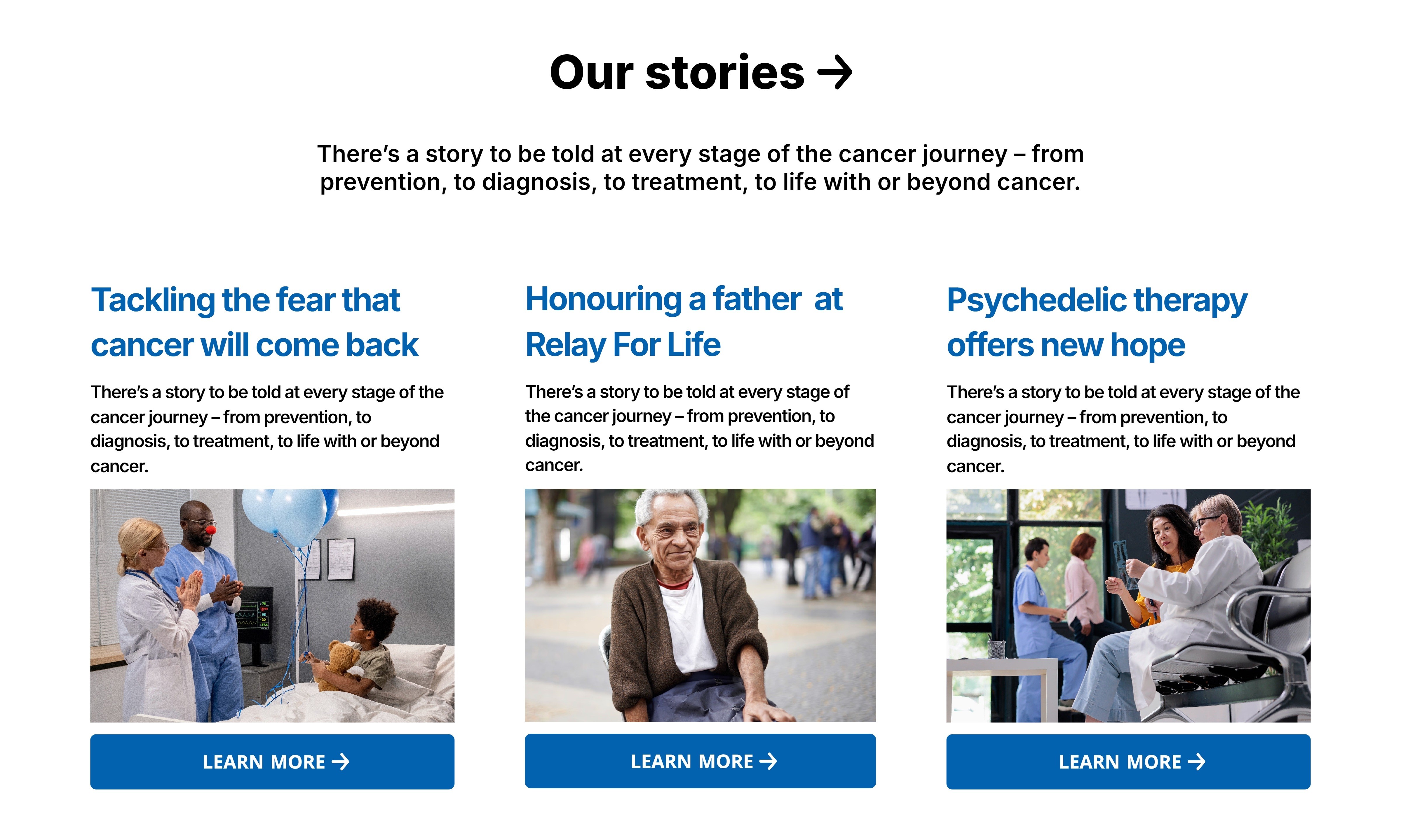
After Redesign
The redesigned section features visually rich story cards with titles, images, and short descriptions. This layout creates an immediate emotional connection and makes it easier for users to find stories they relate to. Clear “Learn More” buttons guide users to full articles, significantly improving accessibility and engagement.
Updated section
A dedicated “Cancer Types” section was added to help users easily search and learn about different forms of cancer. It includes a search bar and a clear call to action, allowing visitors to explore symptoms, diagnosis, treatment options, and more — all in one centralized and user-friendly block.

Before Redesign
The footer was cluttered and visually heavy, with a bright yellow subscription banner and tightly packed links. It lacked visual hierarchy and felt impersonal.

After Redesign
The new footer is clean, organized, and easier to navigate. The subscription area features a friendly image and a calm design, creating a more welcoming and modern feel.

Result


As a result, both the desktop and mobile versions of the website were redesigned. The updated design is more user-friendly, intuitive, and visually engaging. It demonstrates how even within a short time frame, the user experience can be significantly improved and services can be presented in a clearer, more appealing way. The full design is available at the following link.
See all works
→


© Victoria Vakulenko 2025